I’d been playing around with the Windows 10 Preview on my virtual machine and I liked what I was seeing, so as soon as the “reserve your copy of Windows 10” thing popped up on my computer I filled in my name so I would be able to upgrade when it was ready. Despite this fact, it’s been over a month now and my main computer still hasn’t been notified that the upgrade is ready (even though everything is downloaded and seems ready to go).
My laptop was in the same position, but I got tired of waiting – so I tweaked a single registry setting to force my laptop to upgrade immediately. The upgrade started without a hitch and about a half-hour later, it was done. Other than re-arranging some icons on the Start menu and doing some slight preference tweaking, it was ready to use as soon as it was done and there have been no problems with it so far – everything that worked before still works just the same after.
So, now that I’ve finally got Windows 10 running on real hardware, what do I think of it?
Honestly, I think it’s pretty good, though there’s nothing to get particularly excited about. There are no earth-shattering changes or improvements to performance, just lots of small improvements and little tweaks all around. Essentially it’s just “Windows 8, but a little bit different.”
That said, there are a fair number of small things that have been improved and when you add them all up, it does come out to a pretty nice version of Windows – and definitely one I’d recommend over Windows 8 or 8.1. With that in mind, let’s go over some of the most noticeable changes and improvements!
(Oh, and a quick disclaimer: this is all from the perspective of a desktop user; if you’re running Windows on a tablet then I can’t really say how the tablet-specific stuff will have changed for you. Sorry!)
Start Menu is OK
Yeah, yeah, it’s nice to have the Start menu back, but honestly did we really need it back? I’m not so sure.
I know I’m going to get reamed for saying this, but I thought the Windows 8.1 Start screen was just fine. Yeah, it took up the whole screen but it was simple and elegant – all your icons in a nice, even grid. Power and logout options at the top and all your other apps easily searchable or you can click the little arrow at the bottom. You could give the Start screen a separate background, or let it be transparent to your desktop (which is what I always preferred).
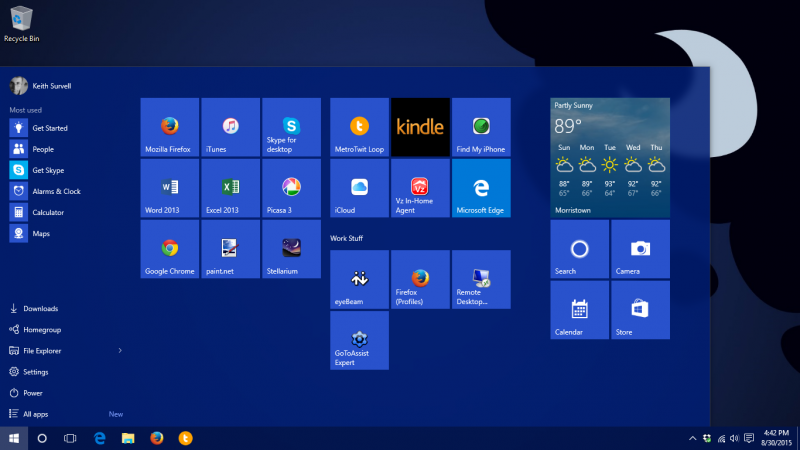
Windows 10 sort-of brings back the old Start menu… kind of. It still has icons as tiles (and for some reason all tiles now all have the same background color, instead of being based on the icon color as they were in 8.1), but there’s sort of a side-section that kinda/sorta functions like the old classic Start menu. But I don’t really see the point – the icons here are smaller, making them harder to click with the mouse, and most people only use a few programs regularly so why have the full list taking up space when you don’t need it?
Still, I don’t hate the “what’s old is new again” start menu, and it does have some nice touches. I like being able to customize what folder shortcuts are on it, and it’s nice to be able to arrange the tiles for program icons.
Oh, but one thing I do not care for is that the Start menu and start screen now scroll vertically instead of horizontally. With most monitors and screens being wider than they are tall, why would you do this?? The horizontal scrolling of the Start screen in Windows 8 and 8.1 was one thing that actually made a lot of sense. Changing it back to vertical scrolling does not make sense, and sadly there is no way to change it back through options. Not the biggest deal in the world, but still, I really wonder why they made this particular change.
Cortana is “Meh”
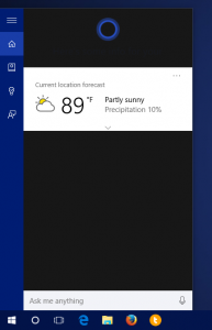
Windows 10 is meant to be used on tablets and it seems like having a “digital assistant” thingy is a mandatory requirement these days, but on a desktop the new Cortana thing is just… meh.
Maybe if you use the built-in Windows calendar and mail and whatnot it’d be more useful, since it can look up and search your appointments and so forth, but if you don’t use those built-in apps, it’s basically just a glorified Bing search with speech recognition.
Also, I don’t like how much space the Search box takes up on the taskbar – it’s huge! Fortunately you can shrink it to an icon (or remove it entirely).
Multiple Desktops are Neat
It’s been possible to do multiple “virtual” desktops for years – I remember using them back in Windows 2000 – but it’s nice to finally see them available and supported natively in Windows. However, I do really think that most people will never use this feature. Instead, it’ll be used mainly by the more techy types. Still, it’s nice to have and I’m glad they (finally!) added it.
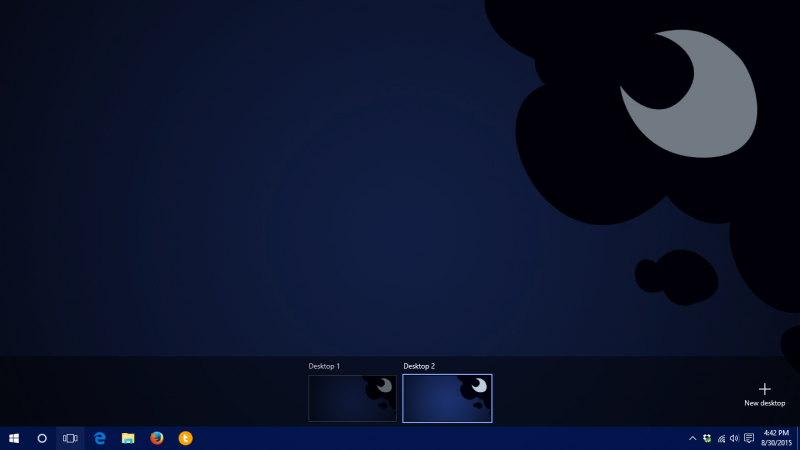
Perhaps once I’ve had a chance to use this feature on my main desktop while actually working (rather than just casually on my laptop) I’ll have more to say about it, but for now, it’s just a “nice to have.”
Notifications At Long Last
It is good to see Windows finally get a unified notification system but holy cow has this been a long time coming! Now we just need to wait for more applications to take advantage of it, instead of using pop-up boxes/balloon tips/etc. for their notifications.
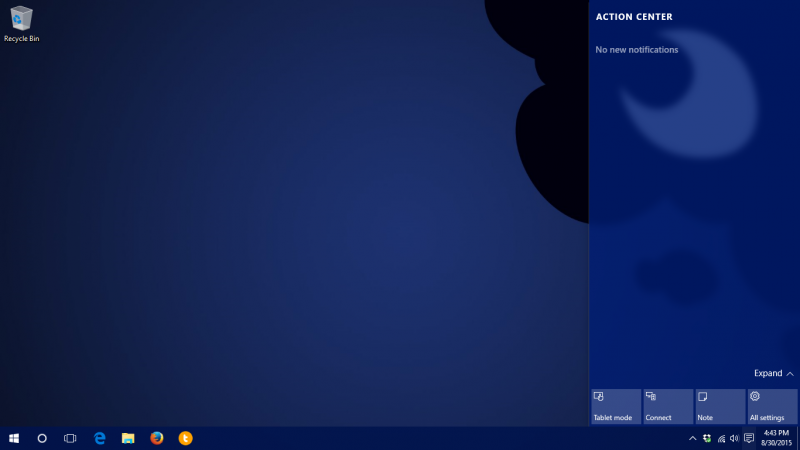
I also like the new “action center” bar, which I tend to think of as an extension of notifications (since that’s where they show up after). It’s a very nice touch and a long-overdue addition to Windows (especially for those using it on mobile devices – tablets, laptops, etc.).
More Consistent Control Panel
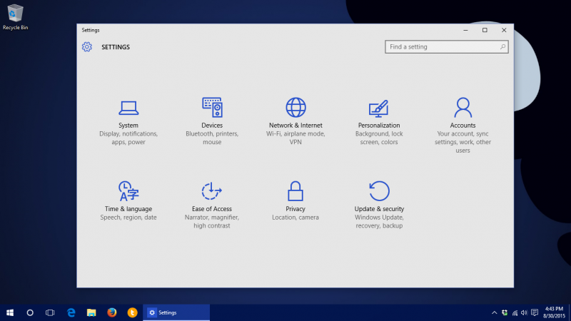
The Control Panel was long overdue for an overhaul, being an inconsistent mish-mash of Windows 7-style and Windows 8-style. Fortunately, Windows 10 goes a long way towards dragging it into the future. The main screen of the Control Panel is simple & clean, and most sub-screens are also done up in the same Windows 10 “flat” style, with lots of slider-type switches (instead of checkboxes) for options.
Resizable Windows
Not being able to resize certain Windows 8-style windows used to drive me absolutely bonkers. It was a very jarring break from the standard Windows UI experience, so I’m very glad they fixed this and allowed all windows (including the “it’s-Windows-style-not-Metro-style” ones) to be resized (like they should’ve been from the beginning).
Flat UI is Getting Better
I’m still not a fan of the overall “flat/tile” visual style that started in Windows 8, but at least it is improving. Someone over at Microsoft finally realized that when you make everything flat & monochromatic you need to add other visual cues to help people know what can be clicked on. Too many things in Windows 8 and 8.1 were just completely undiscoverable unless you actually tried clicking on them. In Windows 10 at least things have outlines and hover effects to clue you in to the fact that they can be interacted with.
NO MORE STUPID CHARMS BAR
I’m not going to lie; I hated the charms bar – with a passion. It was perhaps the stupidest idea in all of Windows 8/8.1 and I am glad it is gone. If the charms bar had a grave, I would be dancing on it right now. (And, I would assume it’s buried right next to everyone’s other favorite bad idea, “Clippy” the Office Assistant.)
In Summary
All of these little improvements add up to a very nice experience in Windows 10. Sure, it’s nothing that’s going to blow your mind, but it’s worth upgrading for. Some people have had trouble upgrading, but this can usually be attributed to driver issues and not Windows itself. (As usual, many manufacturers take their time updating drivers and correcting problems – but this is true with almost every new Windows version.) My upgrade on laptop was quick & easy, and eventually I assume it’ll be just as easy on my desktop as well… eventually. (I’m still going to try and hold out until it tells me that the upgrade is ready – I’d like to try it without having to hack the registry to force it to happen!)
Overall, Windows 10 is a solid upgrade and if you were holding out because you didn’t like Windows 8 or 8.1, I’d say give it a go. And if you have Windows 8.1, upgrading is a no-brainer – at the worst, you probably won’t even notice much of a change, and at the best you’ll appreciate some of the little changes & improvements that have been made.

