 I decided to finally take a look at the technical preview for Windows 10 and give my thoughts on it so far. First off, it was surprisingly easy to get a hold of – unlike past Windows versions, you didn’t need to sign up for any special developer program or anything.
The initial installation experience continues to improve – it was smooth and painless, much like how it was for Windows 8 and 8.1. There was even an option right on the download page to upgrade my current computer – which is pretty neat, though I opted instead to get the ISO file and install it in a virtual machine.
Initial Impressions
At first Windows 10 really doesn’t seem very different from Windows 8.1 – though there is a new search box down beside the Start menu which I’m none too fond of. (Though I understand this is trying to highlight the new “Cortana” search assistant thing.)
Much of the UI and icons are even more stark & flat than before, but then again this is just a preview – it’s expected to be rough around the edges and have placeholder graphics.
 The Start Menu
Ah yes, the elephant in the room: the Start menu. Yes, it’s back to being a menu (sort of). It has a list of programs (as small icons) along the left, and the larger tile icons over to the right – a configuration which somehow reminds me of/seems similar to the application menu in some Linux distributions.
There’s a clear link for “All Apps” (not unlike the “All Programs” button in previous Windows versions) which – finally, thankfully – shows and retains folder order of items on your start menu. Though this won’t be a big deal for most people, for me it’s a big improvement. For most people there’s enough space on the Start menu for their frequently used programs – so they’ll hardly ever have to go into “All Apps.” But for people like me, it’s very nice to be able to scroll through applications alphabetically and that have the ability for some sort of folder/hierarchy to find that one app that you need (but don’t use frequently enough to have it on the main part of the Start menu). This is MUCH better than the “All Apps” screen in Windows 8.1 which was just a massive grid of icons that was very difficult to scan through visually.
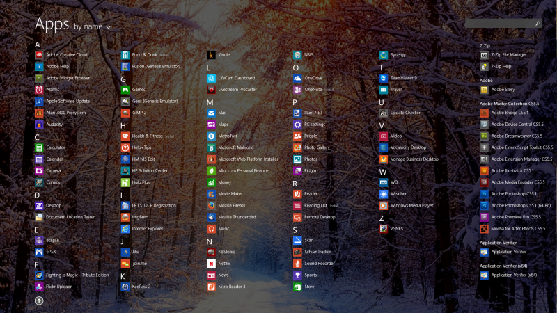
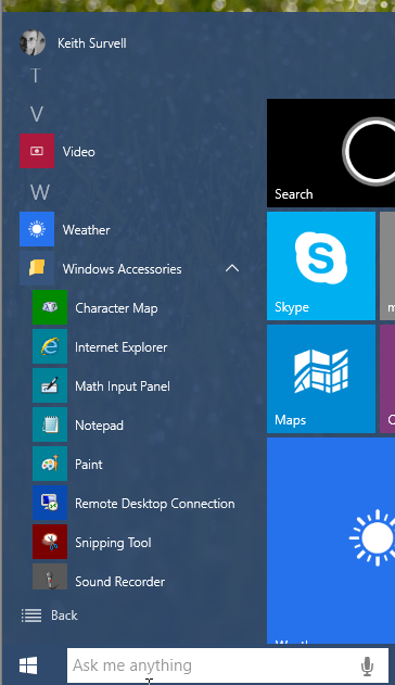
The Start menu can also be expanded to fill the entire screen, like it did in Windows 8 and 8.1 – this gives more room for the larger tile icons, as well as for the “most used” icons on the left. Handy for people who use a lot of different programs and apps, it’s nice to have the option to choose how big you want your Start menu (or Start screen) to be. Honestly, this is how it should have been from the beginning.
The Start menu is also partially transparent, like the Windows 8.1 Start menu is, which again helps make it feel a bit more cohesive with the rest of the UI.
Other Thoughts
It’s nice to see that the previously separated “PC Settings,” “Settings,” and “Control Panel” have been combined into a single screen, accessible from the Start menu, called just “Settings.” The icons for it currently are a bit stark (but again, this is just a preview release) but it’s nice to see that everything is in one place. The way “PC Settings” and the Control Panel were separate in Windows 8 and 8.1 was just weird – very akward, and it felt like there were 2 different OSes that had been jammed together. Now in Windows 10 it feels more like a single OS with a consistent user interface.
Almost all of the control panel applets have been re-done to fit in with the new flat “formerly known as metro” style, which means they’ll look different to long-time Windows users, but I think a little change is worth it to bring about a consistent interface. (The old-style screens are still there though, if you know where to look – but it remains to be seen whether they’ll stay in the final release.)
The new notifications system is a welcome change – it’s nice to see Windows finally catch up with virtually every other operating system. But until more programs support it, I can’t say much about it.
Cortana is, of course, kind of neat – though I couldn’t get sound working in the virtual machine I used to try out Windows 10, so I couldn’t give it a full test. But really, with Siri having been out for as long as it has, do we really need to compare? It will work more or less just like that.
It’s also nice to see that the “charms bar” has finally gone away – I still don’t know how anyone thought that was a good user interface idea.
Final Thoughts
Overall, Windows 10 is a welcome improvement on Windows 8.1 with mainly incremental changes, and a few bigger features (mainly for laptop/tablet users). Like Windows 8.1 before it, it isn’t terribly exciting, but it is demonstrably better. Even as an unfinished technical preview Windows 10 runs slightly faster and smoother in my virtual machine environment than Windows 8.1 does.
Of course, Microsoft is deliberately trying to push out new Windows releases more frequently, which means each release by itself will be less exciting than Windows releases in the past used to be – simply because there’s less time to make lots of significant changes.
Still, Windows 10 looks to be a promising OS and a welcome improvement. It looks to be even more polished for desktops, and it should be even more useful for laptops and tablets. Once it is officially released, I’d say it’ll definitely be worth upgrading for any Windows user.

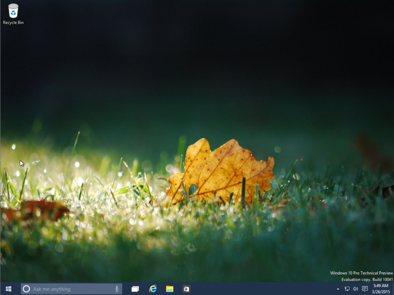
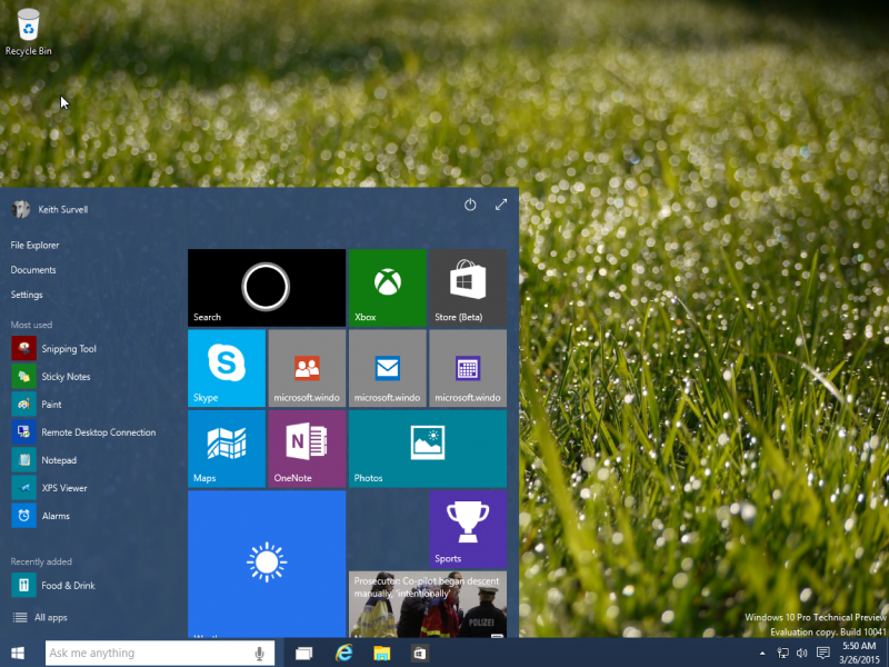
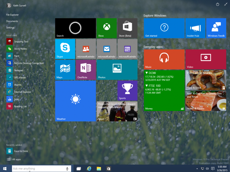
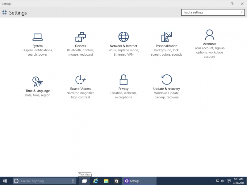
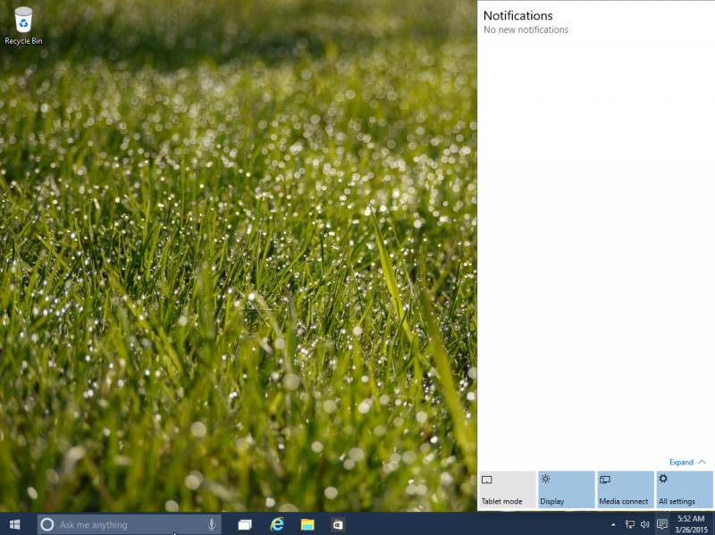
Windows 10 is looks pretty cool & smoother than any other versions. And the best thing is in that the Start Menu back with feels of windows 7 .