 Windows 8.1 was released yesterday, and it’s available as a free update for anyone who already has Windows 8. So, naturally, as soon as it became available, I took the plunge and installed it.
Windows 8.1 is kind of a strange mix of “service pack” and “new operating system,” but the really big question is – is it any better than Windows 8 was? Does it improve on the shortcomings I pointed out in my previous reviews?
Read on to find out!
Installing
 Getting the update was actually a bit confusing. It’s not a Windows update, and doesn’t appear as part of your standard updates – instead, you have to launch the “Store” app and hope that the offer to upgrade appears (I’m not sure what triggers it, as it didn’t appear at first for me).
The installation is fairly straightforward, although it does take a while – even longer than installing a Windows Service Pack used to take.
Still, there were no hiccups and eventually after a few reboots I was back at my desktop. Not a bad start to things! And speaking of “Start…”
Start Is Back, All Right!

The Start button is back – as it should have been all along.
While I understand the reasons behind using the corners as “hot spots” for both mouse and touch gestures, when introducing a new user interface element like this, you need to give some sort of visual cue to… um… cue users into the fact that there is something there that can be interacted with.
The Start Screen, Take Two
The ability to have your desktop show through the Start screen is a very small change, but it goes a long way towards making it feel more “cohesive.” No longer is the Start screen this weird world of squares & rectangles, with no connection to your desktop – instead, it’s just an overlay of icons you can click on, just like the old Start menu was (but bigger).
Windows 8.1’s Start screen also now uses different colors for tiles – and not just Metro app tiles, either. All your application tiles now have individual colors, which usually (but not always) match the color of the icon.
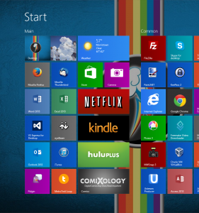
All these colors certainly make the Start screen a bit more visually distinct, but it also makes it look a bit busy. Still, it’s a nice touch to help identify the program you’re looking for at a glance, since the color helps with recognizing an icon before you even read the text.
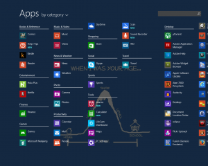
The ability to go to the “All Apps” view by just clicking a single chevron at the bottom of the Start screen is a welcome addition – especially since Windows 8.1 doesn’t automatically dump newly installed program icons on the Start screen like before. Now you can quickly bring up your “All Apps” (the equivalent to “All Programs” in pre-Windows 8 speak) and find your programs (relatively) easily.
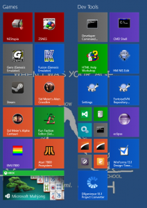
Windows 8.1 also adds some new sizes for icon tiles – instead of “square” and “rectangle,” you now have “tiny square” and “even bigger rectangle.” Not a big deal, but it’s helpful to keep your Start screen organized if you have lots of icons – though only Metro apps can use the “even bigger” tile sizes.
Modern Metro Madness
One small but nice change in Windows 8.1 is that Metro apps can now be split-screened in any proportion – you’re no longer limited to the 1/3 and 2/3 split from Windows 8.
If you have multiple monitors, you can also run Metro apps separately on each one – though I can’t really imagine many people doing this.
(Also, what should we be calling these apps now? They were originally code-named “Metro,” then they became “Windows 8 Modern.” Are they now “Windows 8.1 Modern?” Seriously, they need a better name!)
Search the World
I never understood why Microsoft chose to make search in Windows 8 segmented – it just made no sense to me at all. Previously, searching from the Start menu searched both your Start menu and all of your indexed locations (by default, your libraries) – which is exactly what it should do. Simple, search once and find what you need, no matter where it might be.
But in Windows 8, you had to choose where you were searching – were you searching apps? Or were you searching settings? Or files? And it got worse when you realized that some things (e.g., system settings) were not under “settings,” but actually “apps,” depending on their specific implementation. It was maddening and just made no sense.
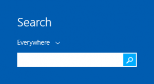 Fortunately, Windows 8.1 undoes this terrible design decision, and by default the search now searches “everything” again. (That is, it searches all your apps and all your libraries.)
On the other hand, Windows 8.1 does by default include integration with Bing for search results – but this is easy enough to turn off if you don’t want to search the Internet every time you try to search your computer.
Boot to the Head – er, Desktop
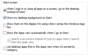
Yep, that’s right – you can now have Windows 8.1 boot directly to the desktop, instead of the Start screen. This option isn’t on by default, but it’s available – and again, something that really should have been there all along.
Is That It?
Yep, pretty much. Windows 8.1 brings a number of welcome changes – though some of these are less “changes” and more “putting things back the way they were” – but at the end of the day it’s a very minor update – just as it’s name would suggest.
The Bad Stuff
Although the installation itself went very smoothly, there were a few hiccups with my upgrade.
I did have to re-install a few programs because they ran as “services” in Windows, and for whatever reason the update had lost or removed the services. I also had to re-install my display driver – Windows defaulted back to the Microsoft provided driver, which works fine, but doesn’t have some features I like and need.
I also had to re-install my printer/scanner software, as it lost the ability to “Scan to” my computer (even though it still printed just fine) – although honestly this is probably more the fault of the printer manufacturer’s often finicky software.
Windows 8.1 also takes the odd stance of removing links for Libraries from the left-hand navigation pane of Windows Explorer window – though thankfully there is an easy option to bring this back.
Also, somehow my Windows theme had gotten changed so that the text in title bars and the task bar was black instead of white – and it’s not at all easy to figure out how to change this back.
Still, all things considered the problems with this upgrade were fairly minor – none of my devices malfunctioned (and I do have quite a few USB devices hanging off my computer) and all my settings were retained. Having to re-install a few programs, although slightly annoying, was not really that bad.
Windows 8.1 Final Thoughts
All-in-all, Windows 8.1 is still very “meh,” just like Windows 8 was – just slightly less so. Not exactly something I’d get excited about, but it is an improvement – albeit a small one.
The “Metro” side of things (or whatever Microsoft is calling it now) remains just as useless as before – although to be fair, there are more apps now and the built-in ones have improved a fair bit. For anyone using Windows on a tablet device, I’m sure these will be welcome improvements, but for the majority of people I’d imagine they will continue to be mostly ignored.
There are also some other changes I didn’t really go over, but to me they are just so minor as to be irrelevant.
If you already have Windows 8, upgrading to Windows 8.1 is almost no-brainer, as most of the changes are definite improvements over Windows 8, despite the few glitches you might encounter along the way.
If, on the other hand, you’re upgrading from Windows 7 or purchasing a new computer, I would definitely say that you want Windows 8.1 over Windows 8 – mainly for the Start button and Start screen improvements.
I didn’t see you mention anything about Windows 8 and email. I continue to have problems opening attachments and saving them to anywhere.
As a solid PC user, I am about to take this computer back and switch to Apple!
I didn’t mention anything about the built-in Mail app because I don’t use it. I use Mozilla Thunderbird, which is a superior mail client any way you look at it.
Also, you’re going to switch to a completely different (and not any less troublesome, no matter what the ads lead you to believe) computer platform just because you have trouble with email attachments? That seems a bit like moving & buying a new house because you can’t figure out how to work the dishwasher in your current one.
Just saying…