 Not too long ago I took the final RTM (release to manufacturing) edition of Windows 8 for a spin and shared my thoughts about it. Well, just the other day I took the plunge, ensured my backup was up-to-date, popped the DVD in and upgraded my computer. (Yes, upgraded – I did not do a clean install.)
So this is technically my second look at the final release version of Windows 8 – and this time I’ve been using it legitimately, all day long, doing all the things I normally do with my computer, and I now think I have a much better “feel” for things, to the point where I’m ready to share them.
Don’t Use Metro – Just Don’t
Yes, I know it’s technically not called “metro,” but honestly, who cares what it’s called? Just don’t use it. Unless you have a touch screen, avoid using metro apps entirely. There is absolutely no reason for you to use them on a desktop PC (or anything that uses a mouse/trackpad/etc. and not a touch screen).
None of the built-in metro apps are very useful, and with so few 3rd party apps, there’s not much else you can do here. And as we’ve already established, metro apps were made for touch screens – if you don’t have a touch screen, using metro apps is going to be frustrating and awkward.
Corners are Fun
In my original review, I thought that the new “hotspots” were limited to only on the primary monitor, but it turns out this is not true – you can use any of the 4 corners of ANY monitor! This means that technically you can use the lower-left corner (where the Start button used to be) of any monitor to bring up the Start page. Pretty sweet!
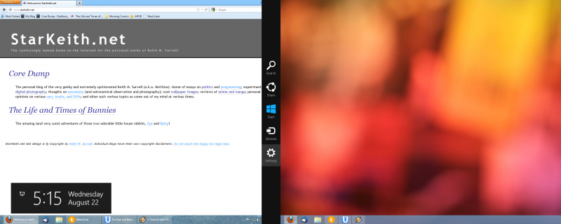
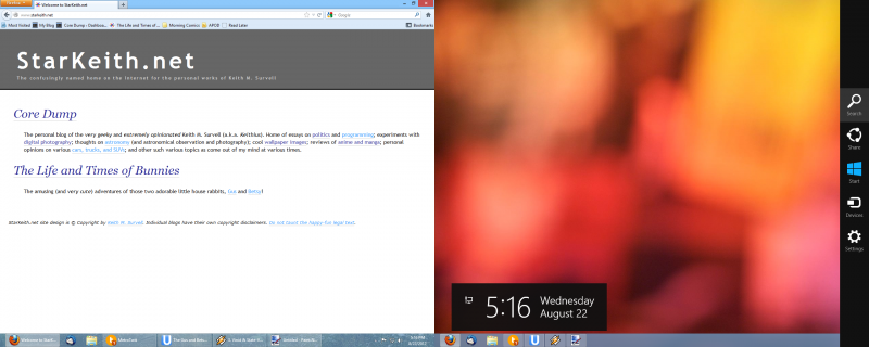 Above: The new “charms” bar can be brought up on either monitor by pointing to the upper-right corner of either screen, and the same is true for all the other corners of the screen.
I Miss The Start Button

This may be nitpicking, but I really do miss having an actual “button” to click to bring up the Start menu (or Start page, or whatever the correct term is for the new full-screen Start screen). Not having a button there just makes the desktop look “unfinished,” and although technically speaking the corner is a much bigger UI target to hit with the mouse, years and years of training have conditioned me to hit a big button in the lower-left corner, which is now… gone.
Well, that’s not quite fair – it’s sort of still there, but it’s hidden, and will only appear once you slam your mouse cursor (or your finger, if you’re using a touch-screen device) into the bottom-left corner of your screen (any screen, if you have more than one).
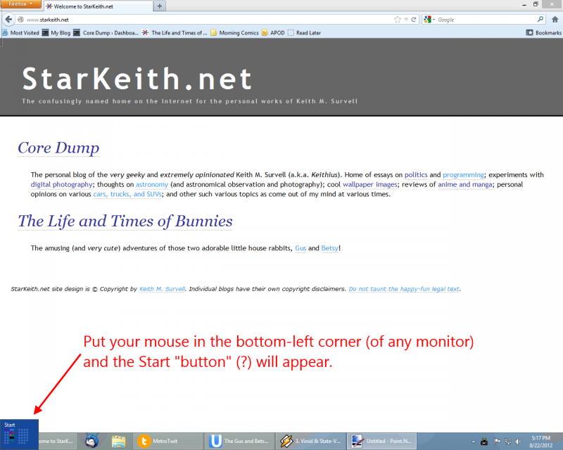
Still, the Start button is not something that should have gone away. I mean, Mac OS still has the little “Apple icon” system menu in the top-left corner, and that’s been there since version 1.0!
But I Do Like the Start Page!
I admit it – I like the new Start page. But one thing should be absolutely clear – I am not your typical user. Most “average” users have about 4 or 5 programs they use frequently. I have… a lot more.
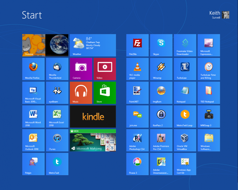
Still, the new Start page is basically an over-sized, full-screen version of the old Start menu’s MRU (most recently used) program list.
The bigger “tiles” are obviously meant to make it more touch-friendly, but a side effect of all this is that you have a lot more room for shortcuts as well – and I like being able to have all my programs within easy reach.
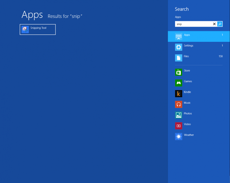
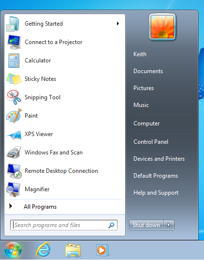
And if that’s not your thing, well you can still search for programs the same way you did before – just start typing when the Start page is on the screen, and it’ll start searching for applications, just like it used to do in the Windows 7 Start menu.
“All Programs” Still Sucks Though
In earlier versions of Windows, you could arrange your shortcuts on your start menu (under “All Programs”) into folders to keep things organized. In Windows 8, you… can’t do that. Instead, you have “All Apps,” the equivalent to “All Programs,” and it is… well, just look:
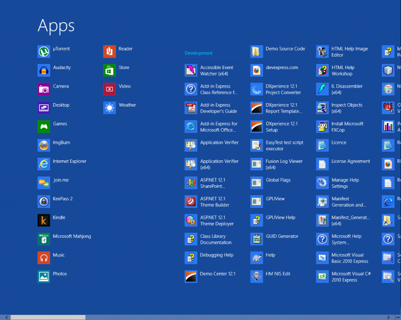
It is a mess, to be sure. Everything is laid out in one big grid, and nothing is hidden. In my case, because I upgraded, things are still in folders (hence the sub-headings you see), but I have no idea how you’d create these headings or organize things.
On the other hand, I don’t really see a need to worry about it. Searching apps is simple and easy, just like it was in Windows 7 (just start typing when the Start screen is displayed), and this is honestly a faster way to find the program you’re after, no matter which OS you’re using.
Hate Metro? Consider the Alternative
I see a lot of vitriol out there for Windows 8, when really what people don’t like is the new metro-style apps and interface.
This is fine, and in case you can’t guess, I don’t exactly like the metro-style interface either. It really makes the OS feel like it’s got a split personality, and more than a few people have suggested that it might have been better to split off into 2 separate OSes, instead of trying to awkwardly combine them.
But consider the alternative – what if Microsoft had done exactly that? What if they had made an OS (the Metro OS) for tablets, and one for desktop PCs?
Keep in mind that the benefit of an OS is not the OS itself, but the programs and applications that the OS lets you run. So to begin with, a new Metro OS would have been worth… nothing. Because there would have been NO apps for it. If Microsoft had done this, the Metro OS would have been a complete failure.
Microsoft had to include compatibility with existing Windows apps in the new Metro OS, and if they were going that far, why not just merge the two OSes together, instead of re-inventing the wheel and wasting a lot of effort maintaining them?
Oh, sure, you can argue that this is exactly what Apple did with OS X and iOS – but keep in mind that iOS was in a unique position when it started out, since it had the first-mover advantage. There was no other big smartphone OS to compete with it (well, not really), and also Apple included some really great starter apps to make up for the fact that no other 3rd party apps existed.
On top of that, iOS got its start on phones, which are useful even without apps (you can still use them as a phone, after all) and they also had the famously popular iPod music player capabilities built-in.
Our hypothetical Microsoft Metro OS would have none of these advantages – it would start on tablets instead of phones, and tablets are nothing but very expensive paperweights without lots and lots of useful applications.
This is why it had to be merged with the regular Windows desktop OS, and it kind of explains why we ended up with the OS we ended up with in Windows 8. Sure, Microsoft could have shipped a “desktop only” version of Windows 8 without metro… but if they did, people would instead just be demanding to have some new “Pro” or “Ultimate” version of Windows that had both, and we’d be right back where we started.
An Acceptable – but Uninspiring – OS
The bottom line is, the whole metro apps thing in Windows 8 is a bit of a gimmick – at least as far as I’m concerned. I have no idea if Microsoft’s marketing might can make this last into the next version of Windows (or even past the next service pack), or whether it will quietly fade away and die, much like its spiritual predecessor the Zune did (remember the Zune?).
But the good news is, you don’t have to use metro apps. In fact, beyond the big Start page, you never need to see any “metro-ish” stuff in your day-to-day use. You can use the same programs you’ve been using all along in Windows 7, and aside from some slight UI tweaks, you’d almost never even notice the difference 99% of the time.
So my verdict on Windows 8 remains much the same as before (although for slightly different reasons) – it is a perfectly OK, average, and uninspiring update to a popular operating system. While I wouldn’t exactly rush to upgrade, I wouldn’t go out of my way to avoid it, either.
Update: After using it for even longer (6 months now), I’ve posted my (final) thoughts on Windows 8.
Hi Keith,
Your ‘Core Dump’ article on using Junctin points to move the Users directory to another drive is just about the best ever tech article I have ever come across – I return to it time and again – So thanks for that! I am just wondering if you know if this will work in Windows 8? I have just rebuilt my PC with a new SSD and was planning on using the junction points to move the users folder but I also intend to upgrade to Windows 8. Any thoughts on if this is worth doing pre-windows upgrade and if it would still be possible in Windows 8 anyway?
Well, the underlying file system remains the same, so using junctions to “move” folders to a different drive or volume will still work in the general sense.
As I’ve said before, with the “Libraries” feature introduced in Windows 7, there is less need for this – libraries let you put the bulk of your profile data somewhere else without the need for fancy folder redirections & such.
If you are planning on upgrading (that is, doing an in-place upgrade) to Windows 8, I would wait until after you upgrade – just to reduce the chance of something going horribly wrong.
If you are planning on upgrading by doing a clean re-install, then I would forget about junctions and look instead into using an unattended setup file instead – that’ll let you put your User Profile folder (as well as other folders) wherever you want – including on a different drive. Since this is done as Windows is being installed, there’s no “trickery” involved, and it is 100% supported by Microsoft.
If you’re getting an SSD, you’re probably going to do a clean re-install anyway, so that’s what I’d recommend.
But as far as I know, the actual techniques used should still work in Windows 8 – under the hood, it’s still pretty much the same as Windows 7 (in respect to the stuff we’re talking about).
Of course, you might also want to peruse the site SuperUser.com and ask some of the many nice people over there about this – they probably know more about this than I do. 😉