So, I was able to get my hands on the final release version of Windows 8 the other day (thanks to the TechNet subscription I get through work), and in order to give it a proper look-see, I decided to install it on my computer using my real hardware, but also use a virtual hard drive. This would save me from the troubles of dual-booting (and potentially screwing up my existing Windows 7 installation), while still letting me run on “real” hardware (unlike a virtual machine).
Fortunately this was really easy (this guide from Scott Hanselman is how I did it), and it allowed me to not only give Windows 8 a proper test drive, but to do so using my dual-monitor setup.
It is worth nothing that I was not going into this blind – I’d taken a look at the Windows 8 Consumer Preview before, both in a virtual machine and on my netbook. (I had to give up on the netbook because Windows 8’s new UI requires a higher vertical resolution than my little old 10″ screen can provide).
Windows 8 – First Impressions
The setup is very familiar – the same basic “installing Windows” experience we’ve had since Vista, I believe. But it goes by very smoothly, with all the questions up-front, and it doesn’t take forever (which is always nice). In fact, the actual initial “installation” went by surprisingly fast – although after a reboot there’s still more “setting up” to be done. Still, a good start.
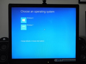 Since I was dual booting (sort-of), Windows 8 detected this and installed a very nice boot loader/OS-chooser thing. It’s graphical, which is neat, and very well designed – simple and to the point. However, this screen doesn’t appear right away – it seems like Windows 8 pre-loads itself, and only later does it show you this screen. This means that you have to wait a while before you can choose your OS. Presumably this is done because Windows 8 is set as the default OS so it just starts pre-loading it, assuming that 90% of the time you’re just going to boot into that.
Interestingly, if you change the default OS, the boot loader/OS-chooser changes as well. I changed mine back to Windows 7 as the default, and after I did, it showed the more traditional text-based Windows 7 OS chooser, which appears immediately after the BIOS POST stuff is done. So, apparently you only get this neat screen if you keep Windows 8 as your default OS.
The rest of the setup was pretty simple – enter your email address as your login and it’ll use your Microsoft account (if you have one). One of the potentially neat features of Windows 8 is how your user account is now sort of online, so if you switch computers some of your settings will come with you. I only have the one computer, so I wasn’t able to try this out, but it has some potential. Also, since your Windows login is tied to an online account (and thus, to your email address), recovering your password if you forget it is a bit easier than it ever used to be on a PC before. So that’s nice.
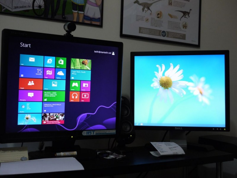
Once things booted up, I was greeted with this setup:
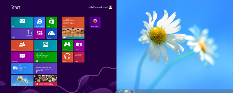
As you can see, the new Windows 8 UI is on the main screen, while you can see the old Windows desktop peeking through on my 2nd monitor.
At this point we’re going to need to address something – during development, this new UI style was code-named “Metro.” But just a few weeks ago, Microsoft announced that this is not going to be the final name for it – but they haven’t given us what the final name is going to be yet. So, in the interest of brevity, whenever you see “Metro” in this post, just read it as “the UI formerly known as Metro” or whatever pleases your fancy. Perhaps when they finally announce the real name I’ll come back and change it here.
ANYWAY – the new Metro UI, based on tiles, is your new Start page. If you’ve used Office 2010, you’ve seen something like this before – it’s what is called “Backstage View” in Office 2010 – and it’s what happens when you click the “File” menu/tab in most Office 2010 apps.
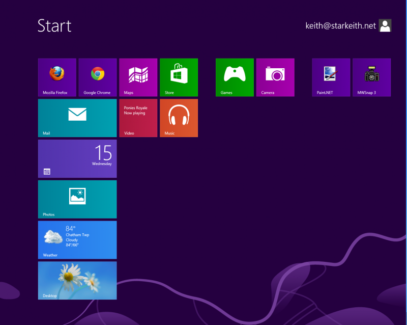
Of course, it’s a bit more complex than that, but this is a good way to think of it to begin with. The tiles are interactive, and you can drag & drop them all over the place as you’d expect. The tiles “flow” from one column to the next, in a left-to-right order, meaning that you can’t leave any gaps on the column to the left – it automatically fills with tiles from the next column over. At least, it did for the first 2 columns. The 3rd and 4th columns seem to be all on their own, and this is presumably likewise with subsequent columns on additional screens (which would appear to the right, and not down, as you might think – more on that odd convention later).
Native Metro apps can have double-width rectangular tiles, while the tiles that represent shortcuts to regular Windows programs will only have the square tiles.
Since this new Start page/view replaces the old Start menu, this is where you will find every icon/shortcut on your computer. That is to say, if you had an icon anywhere on your Start menu, it will be a tile here on this new Start page instead.
UPDATE: As it turns out, the new Start page actually is more like your “most recently used” items list, as opposed to “All Programs.” Only some shortcuts show up here by default to start with. The rest can be found under “All Apps,” which shows them all in one giant grid as I described here (but with slightly smaller icons).
This is a bit of a design flaw if you ask me – there’s not really any way to organize tiles other than by putting them in columns and spreading them across different pages (the Start page scrolls horizontally). There are no folders or sub-folders like you might be used to from the old Start menu. And if you install any old-style programs, your Start page will inevitably become cluttered with useless shortcuts that you never use.
While it’s easy enough to delete these, it is a bit awkward. And since the tiles on the Start screen are bigger than icons on the old Start menu, this sort of clutter is much more noticeable.
The Traditional Windows Desktop is Still Here
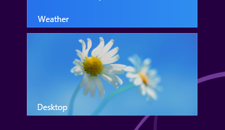 Fortunately, it is super-easy to switch to the traditional Windows desktop. On my computer in particular the desktop was still visible on my 2nd monitor (the Metro start page only covers one screen), and there’s a handy (and large!) shortcut for it right on the Start page.
Once you’ve switched to the traditional desktop, you don’t ever have to see the Metro UI again, unless you click where the Start menu button used to be, or press the Windows button on your keyboard.
As for how things work in the traditional desktop, well… they work just like you’d expect them to. It’s just the same desktop we’ve always had, but better. If these were the only changes in Windows 8, you’d be seeing nothing but praise.
It’s great that the taskbar now appears on all of your monitors (instead of just one), and the “ribbon” type UI in Explorer is kind of neat. Also, the new file copy dialogs are pretty sweet, with the extra info they can give you, as well as the better prompts that appear when you copy files with the same name.
In general, the traditional desktop UI is a bit more… well, square-ish, for lack of a better word. There is a bit of metro-ish UI inspiration here and there, and I sometimes feel like going back to a sharp-edged square UI is a step backwards (remember when having curved edges to a window was a big deal?), but otherwise is it just fine, no real surprises to speak of.
The UI Formerly Known as Metro
OK, I know you’ve probably been waiting for this part – so let’s talk about Metro.
The whole Metro UI is obviously very much inspired by the concept of touch – you see references to it everywhere.
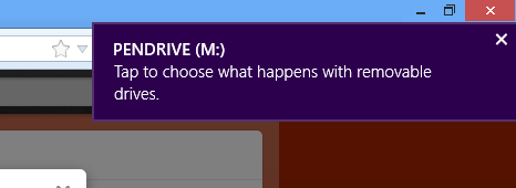
Having spent a good deal of time doing tech support for people, I can tell you right now that the Metro UI is going to confuse a LOT of people. There is a heck of a lot to get used to here, especially if you are using it on a PC without a touch screen (as most people will be).
Another thing that is inevitably going to trip a lot of people up is that Metro apps do not have a close button, and in many cases they don’t even have a “back” button, either. There literally is no way to “exit” the application in the traditional sense; and this is by design.
Metro apps are completely suspended when they are in the background, meaning they do not use any CPU time, so there technically is no reason to ever close them. This is much like how on iOS once you open an app, it is still “open” in the background when you switch to other apps, and remains open until you do a hard-shutdown of the device (or press & hold the “home” button to show running apps, then touch & hold the app’s icon to make them shake and have a red “x”, which is how you can actually force them to close).
(There are ways to close Metro apps, obviously, but they are not at all intuitive – probably because they are meant to not be necessary in normal use.)
This… takes some getting used to. I admit I found myself in a Metro settings screen and wanted to go “back” out… but couldn’t find any way to do so. For example, look at the picture below and see if you can figure out what you need to do to get out of this window.
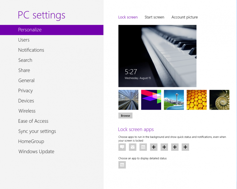
If you guessed “move your mouse to the upper-left corner and hover there for a second, then click the thumbnail which will appear,” you’re either psychic or you’ve used Windows 8 before.
Which brings me nicely to my next topic, which is task-switching in Metro.
Task Switching Just Got… Harder?
In the traditionial desktop, you had the taskbar, which was docked to the bottom of the screen. In Metro, you’ve got… something not unlike a taskbar set to auto-hide and locked to the left-hand side of the screen (each screen if you have multiple monitors). To access it, you hover your mouse in the upper-left corner, which will show (after a moment’s delay) a thumbnail of the last Metro app you were in. You will also see a tiny bit of the edge of thumbnails of any other Metro apps that are open (as well as a thumbnail for the traditional desktop) going down along the left hand side of the screen. Moving your mouse down over these slim edges will cause them to pop fully out, at which point it really starts to resemble the taskbar, just with thumbnails and on the left side of the screen.
This isn’t so bad, as far as it goes, but it does take some extra work to switch apps. (Using keyboard shortcuts still works as before, however.) If you were someone who set your taskbar to auto-hide, this might not bother you as much, but it is still cumbersome to use, especially if you’re used to the default taskbar behavior (which was to be visible all the time). I think this is the “make it tablet friendly” mentality showing through again – on a tablet, you don’t want precious screen space taken up with non-active UI elements like a taskbar. But for a PC with a mouse and a big screen (or multiple screens) it is just annoying.
Finally, there’s a big UI “fail” in the form of the “charms bar.” This is the bar that appears on the right side of the screen if you hover your mouse on that side of the screen, or if you hover your mouse in the upper right corner.
This charms bar has a search button and the settings button, among a few other things. It’s not a bad thing by itself, but the given that:
- This bar is always on the right side of the screen
- The metro UI is only ever on one monitor
This means that if you have multiple monitors, and have a screen to the right of the screen where the Metro UI is, then this “charms bar” is infuriatingly difficult to bring up, because your mouse keeps “sliding” past the edge of the screen and onto the next monitor!!
The whole idea of using the corners of the screen as “hotspots” like this comes from Fitts’s Law, and that’s all fine and good… but when you have multiple monitors, Fitt’s Law doesn’t apply to the side of the screen between two monitors, because it’s not really the “edge” of the screen anymore!
UPDATE: As it turns out, this isn’t quite as bad as I originally thought, because you can also use the corners of any additional monitors as well. In my setup, this meant that I could use the top-right corner of my 2nd monitor (where Fitts’s Law did apply), in addition to the top-right corner of my primary monitor. That said, getting all the way over to the far side of a multi-monitor setup is a lot of mouse movement.
Horizontal vs. Vertical Scrolling
This is a bit of a pet peeve with me, but… In the new Metro start page, and in all Metro apps, there is NO vertical scrolling. Instead, things scroll left to right (horizontally). Which kind of makes sense for a tablet because the natural thing to do is swipe left and right… but it just feels wrong.
Considering that basically every PC in existence has a mouse with a scroll wheel on it – a wheel that scrolls UP and DOWN – the fact that they decided to make the default scrolling in Metro be RIGHT to LEFT is just utterly incomprehensible to me.
The apparent obsession with touch & tablet design in Windows 8 makes me imagine that there was someone at Microsoft screaming at the Windows team, saying, “tablets are going to be the next big thing! We have to work on tablets!!”
…Which, considering the news about Microsoft Surface, doesn’t actually seem that far-fetched.
Final Thoughts
I wanted to like Windows 8 – and I guess I do. It has some differences to be sure, but what new OS doesn’t?
It is going to be a support nightmare. This is not an incremental change – this is significant departure from the conventions of desktop computing that we have all gotten used to over many, many years. Bringing these tablet-style conventions to a desktop OS is, frankly, more than a little jarring. I do not envy the people who will have to support large numbers of office workers when they switch to Windows 8.
There is going to be the inevitable resistance from people who don’t like change of any kind. People like what they know, and Windows 8 changes a lot of things (for better or for worse).
That said, is Windows 8 done well? Is it well executed?
In my opinion, the answer would be… no, not really.
Taken apart, the Metro UI and the traditional desktop are done very well. By itself, the Metro UI would have made a fascinating new OS, which would have gotten a lot of praise and been tried out by lots of curious people. But when you try to mash these two worlds together – the world of the touch screen device, and the world of the mouse-driven desktop PC – you end up with something that is just not as good as either part alone.
Now, is Windows 8 “stay away” worthy, like some said with Windows Vista (or its spiritual predecessor, Windows Me)? No, I don’t think so. It has its oddities, but the desktop is still there, and as I’ve said, it’s easy enough to just treat the Metro UI as a glorified “backstage view” start menu. The other benefits and improvements to the underlying OS and the desktop side of things are well worth it.
All in all I’d say give it a go if you have the chance, but I wouldn’t rush it.
Update: I finally went ahead and upgraded my computer to Windows 8 “for real,” and after using it for a bit, I’ve posted my more in-depth thoughts. Give it a read!
Update 2: After using Windows 8 for even longer, I’ve posted some more thoughts.
2 comments
Comments are closed.