This is a question that has been floating around in my head for a while now: Is the MDI windowing model dead?
I think the answer is: maybe yes, and maybe no.
It’s certainly true that the “traditional” MDI (multiple document interface) model has fallen out of favor, for a lot of reasons – not the least of which is it looks kind of dated. But other, very good reasons are:
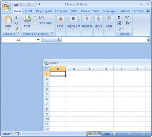
- For many users, the idea of “windows within windows” is confusing. Microsoft Excel is one major application that even today still uses this “classic” MDI model, and I cannot tell you the number of times I’ve had to talk people through how to manipulate their windows. Mostly, people don’t understand “windows within windows” and when the MDI child window isn’t maximized to its parent window’s size, it can be dragged all around – often accidentally towards the edge of the parent window, where it hides the close box and other window controls – like scroll bars – and people don’t know how to get it back.
- The reasons for having “windows within windows” were born in a different time – as far back as Windows 3.1, at least. Back then, it made sense to have a “parent” window that could control all of it’s “child” windows, because you didn’t have things that we have now – like the taskbar – for switching easily between windows. Times have changed – with bigger screens (and in some cases, multiple monitors) there’s just no real “need” to confine windows to a single, larger, parent window – it just adds unecessary complexity.
- Taking a step back from a pure Windows-centric view, the “classic” MDI model also doesn’t work in everyone’s favorite medium for new applications – the web.

So, for these (and probably other) reasons, the “traditional” MDI model is effectively dead (with rare exceptions like Excel).
Or is it?
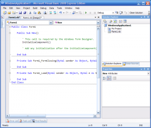
It didn’t occur to me at first, but when you think about it, the MDI model is still with us today – we just don’t recognize it. It’s a “new” model, that can be used in both windowing environments and on the web. In fact, chances are you’re using it right now to read this article – I’m talking of course about tabs.
Think about it – tabs allow you to have multiple documents open – the only distinction being that they’re not really “windows” in the classic sense (they can’t be resized independently, nor do they have all the traditional window controls), but in essence they are windows. So really, the MDI model lives on, but now it’s a “tabbed” MDI model instead.

Tabs take away all of the negative aspects of the traditional MDI model, but keep the flexibility of multiple documents (or pages or whatever) within the same application. In fact, tabs today have become so ubiquitous that it’s easy to not recognize them as being a form of MDI.
That’s not to say that tabs don’t have their problems – because they do. For example, if you try to create a tabbed MDI application, but you also want implement one of the new “ribbon” style toolbars, you’ll end up with tabs in your ribbon and tabs in your windows – which can be confusing as well.
Still, the tabbed MDI model does address a lot of the shortcomings that the traditional MDI model had – and although the traditional model has pretty much gone the way of the Dodo, the tabbed MDI model has been firmly implanted in the toolkits of application developers worldwide, and I think it will be here to stay with us for quite some time.
I think it’s interesting that Microsoft pushed the MDI model for quite a while. In fact I’d say they’re probably the ones that popularized it. And then Microsoft abruptly changed their usability recommendations (quite a while back). Apple’s usability recommendations have been far more consistent over the year, which helps developers to some extent in the long run.
Astute readers will note that the latest Microsoft guidelines (the “Windows Vista User Experience Guidelines” or just the “Vista UX Guidelines”) borrow rather heavily from Apple… 😉