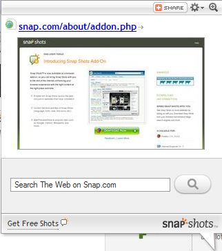
Recently I’ve found more than a few websites using a very annoying pop-up preview thing – you’ve probably seen it yourself, popping up when you mouse over a link on a web page. It’s from some place called “Snap,” and it shows you a preview of the page the link leads to – I guess so you can… see it before you see it?

Maybe it’s just me, but I don’t see the point. In this day and age – with tabbed browsing available from all the major web browsers, there’s just no need for a “preview” of a link. Just open the link in a new tab! Seriously!
Considering how much people hate other kinds of “pop-ups,” it’s surprising that they’d put up with these kind. And even more confusing is why website authors themselves would include the functionality in the first place. Maybe they just think it looks “cool?”
Personally, I find it terribly distracting at best, and at worst I find that it totally breaks the web – it stops you from reading the content behind it, it causes random asynchronous requests from your browser (using AJAX no doubt), and it just slows down the whole experience. If you’ve got a page with more than a few links on it, and you move your mouse over the page, you might be in for quite a surprise as dozens of these little pop-ups try and spring to life, like monsters born from the dust of some evil pixie or something. Never mind that the preview is too small to really make a difference anyway. The most you can hope for is to see whether the linked page uses a particular color scheme. It’s like trying to preview a page by looking at your monitor while seated 20 feet away.
In short, utterly useless.
Agreed, that Snap drives me crazy but I hadn’t sat down and thought about how annoying it is until now. Fortunately you can click that cog and disable it for all sites which I’ve now done – hopefully I’ll never see it again!
Yeah, I’ve disabled them too – although I still don’t understand what the point of it is. I guess now I never will!